New Features May Cause More Driver Distraction than Usability
Last month, both Apple (CarPlay) update iOS 13 and Google (Android Auto) 10.0 launched updates to their available vehicle smartphone infotainment systems. While these updates promise to improve driver interface with popular apps like music, navigation, and phone features, Apple’s CarPlay update may have a hidden issue.
The Impacts of Distracted Driving
Distracted driving has become a major focus in improving roadway safety, especially among younger, more tech reliant drivers. Most states have distracted driving laws on the books now, but a ticket for driving while distracted may not be the only consequence. Auto insurance companies are also penalizing drivers who are cited for distracted driving or worse, cause an accident due to being distracted. Depending on the state you live in, your insurance carrier, and other factors, a distracted driving ticket could come with an insurance premium hike by as much as 56%!
CarPlay and Android Auto aim to reduce driver distractions by allowing the driver to interact with their smartphone by way of their vehicles infotainment system. By using larger icons and minimized functionality their aim is to reduce driver distractions while also allowing the driver to interface with their smartphone.
“The Biggest Update Ever”
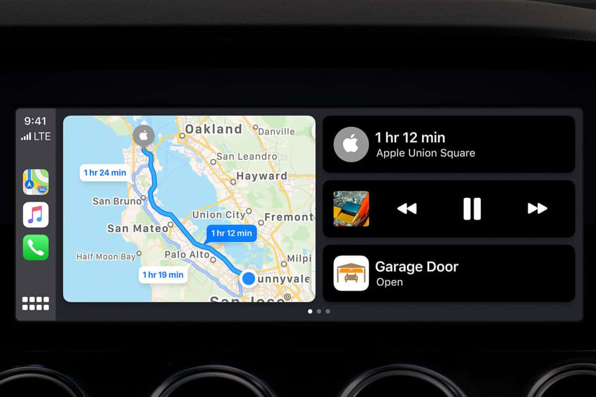
One of the biggest changes Apple CarPlay users will notice right away is the elimination of the previous app grid. Instead, when users connect their phone, they will see a home screen that Apple is calling a Dashboard. This home screen will be divided into three sections. The middle will be home to a large Apple Maps screen, and the right will house audio controls. While on the left side, frequently used apps will appear.
This all sounds promising, especially for reducing driver distractions, but there may be a hidden issue with CarPlay…
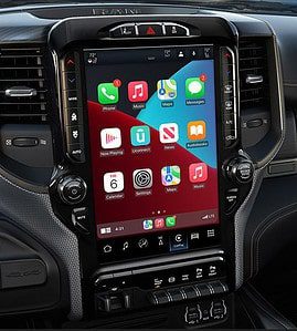
In a pre-launch press release, Apple stated that their new CarPlay Dashboard would scale to fit more varied screen sizes and resolutions than previous versions. Here is the problem with that, in cars with smaller screens the new Dashboard can become condensed and cramped making icons and text difficult to read and interact with. “If drivers are having to take their eyes away from the road in order to select music, or change some other function, then they are no longer focused on what’s in front of them.” said Sgt. Kevin Jamison of the Erie Police Department.
Despite the potential issues that the new CarPlay may pose with smaller screens, many of the updates are designed to improve and reduce distracted driving. Apple is calling this new update, “the biggest update ever” for CarPlay. Along with the new Dashboard, CarPlay will feature a Dark Mode, and a full hands-free Siri support for third party navigation apps along with a Do Not Disturb feature.
If the goal is to reduce driver distractions by eliminating the amount of time a driver needs to look at their smartphone, then both Android Auto and Apple CarPlay do a good job overall. However, if using your vehicles infotainment system is cumbersome and a driver has to focus on small icons and more precise finger placement for selection, then CarPlay may fall short.


